
Rabik hussen
Data Analyst | SQL, Excel, Tubule, Power BI & Python Specialist
About Me
Hi, I’m Rabik, a results-driven Data Analyst with a passion for transforming raw data into clear, actionable insights. With hands-on experience in Excel 📊, SQL 🧩, Power BI 📈, Tableau 📉, and Python 🐍, I specialize in data cleaning, visualization, and storytelling that empowers teams to make smarter, data-informed decisions.From building interactive dashboards to uncovering key trends, I enjoy turning complex datasets into meaningful stories that support business growth and strategic thinking.💡 I see data not just as numbers, but as a powerful tool to solve problems, uncover opportunities, and drive smarter decisions.
Skills
🧩 SQL | 📊 Excel | 📈 Power BI | 📉 Tableau | 🐍 Python
Data Visualization
Business Analytics
Report Development
Team Work
Featured Projects
SQL | POWER BI
SALES ANALAYSIS DASHBOARD
Automated a previously manual process by developing a SQL script and an interactive Power BI dashboard to extract, analyze, and visualize sales data, resulting in improved efficiency and faster decision-making.

Excel
Coffee SALES ANALAYSIS DASHBOARD

Built an interactive Excel dashboard to explore coffee performance across countries, roast types, product sizes, and customer segments, enabling detailed analysis and trend identification.
POWER BI
Adidas SALES ANALAYSIS DASHBOARD
Designed an interactive Power BI dashboard to analyze Adidas sales data across regions, products, and retailers, enabling clear visibility into performance and trends.

SQL
SQL | COVID-19 DATA CLEANING & PREPARATION
Utilized SQL to clean filter and analyze COVID-19 data by country, date range, and case type, enabling targeted insights into infection trends, recovery rates, and regional impacts.

Thanks
Thank You for Visiting My Portfolio!I appreciate you taking the time to explore my work.
If you're interested in discussing opportunities for me to join your team, please feel free to reach out.
Contact Me
SQL | POWER BI
SALES ANALAYSIS DASHBOARD
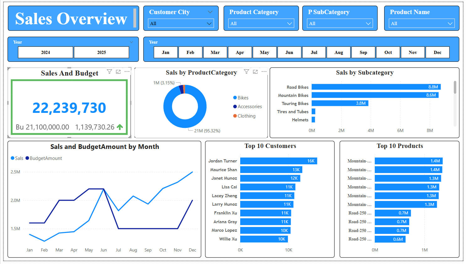
🔍 Initial Business Questions & ObjectivesBefore building the dashboard, the following key business questions guided the analysis:1. What is the total sales performance compared to the budget?
2. Which product categories and subcategories contribute the most to revenue?
3. Who are the top customers by sales?
4. Which products are selling the most?
5. How do monthly sales trends compare to the budgeted amounts?
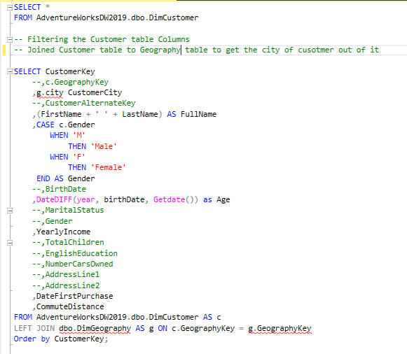
6. Can sales performance be sliced by different filters like year, month, customer city, product category, etc.?These questions were critical in driving data-driven decision-making and providing stakeholders with actionable insights.---🧩 Steps Taken in Building the Analysis1. Data Preparation with SQL* Before importing data into Power BI, I used SQL queries to:* Filter and clean the raw data.
* Join relevant tables (e.g., sales, customers, products).
* Pre-aggregate some metrics to improve performance in Power BI.
* Exclude unnecessary columns or records, ensuring a focused dataset.This SQL layer ensured that the data model imported into Power BI was clean, efficient, and ready for analysis.
Automated a previously manual process by developing a SQL script and an interactive Power BI dashboard to extract, analyze, and visualize sales data, resulting in improved efficiency and faster decision-making.
2. Data Modeling in Power BI* Established relationships between tables using primary/foreign keys.
* Built a star schema model with fact and dimension tables.
* Created custom DAX measures for:* Total Sales
* Budget vs. Actual Comparison
* Monthly Trends
* Top Customer/Product Analysis3. Designing VisualizationsEach visual answered a core business question:* KPI Card: Total sales vs. budget with variance and growth indicator.
* Donut Chart: Sales distribution by product category.
* Bar Chart: Subcategory sales breakdown (e.g., Road Bikes, Mountain Bikes).
* Line Chart: Monthly sales vs. budget comparison.
* Top 10 Customer/Product Charts: Identify key revenue contributors.4. Interactive SlicersSlicers were added to empower user-driven insights:* 📅 Year & Month Slicers: Select specific timeframes.
* 🌆 Customer City Slicer: Regional performance analysis.
* 🛍️ Product Category / Subcategory / Product Name Slicers: Drill down into product-level performance.Slicers enhanced user interactivity, making the dashboard dynamic and customizable for different stakeholder needs.

📊 Key Insights & Takeaways1. Exceeded Sales Target:* Actual Sales = 22.2M vs Budget = 21.1M → $1.14M above target2. Dominant Product Focus:* Bikes generate 95%+ of sales — a clear product strength.3. Top Subcategories:* Road Bikes and Mountain Bikes together account for the majority of sales.4. Customer Value:* Jordan Turner is the highest value customer with 16K in purchases.5. Seasonality Insight:* May and June show peak sales — ideal for future promotions.6. Product Performance:* Mountain and Road Bikes dominate top product sales; room to promote accessories and clothing.---🧠 Final ThoughtsThe completed Power BI dashboard delivers a comprehensive, interactive, and executive-ready view of sales performance. By combining SQL pre-processing with powerful Power BI visualizations, I ensured the solution was both accurate and responsive.This dashboard serves as a critical tool for tracking KPIs, identifying opportunities, and aligning sales strategy with real data.
Excel
Coffee SALES ANALAYSIS DASHBOARD
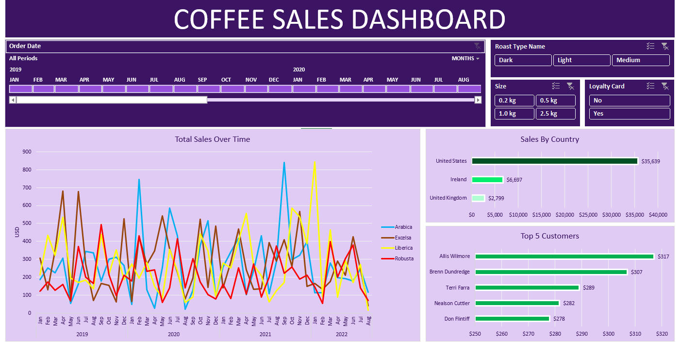
☕ Coffee Sales Dashboard - Excel Project📊 Project OverviewThis project presents an interactive Excel dashboard designed to analyze coffee sales data across various dimensions including time, roast type, customer behavior, and geography. The dashboard is aimed at enabling decision-makers to monitor performance trends, customer insights, and product preferences in a simple and visual format.---🎯 Business Questions AddressedBefore building the dashboard, the following key questions guided the analysis:* How do total sales trend over time across different coffee types?
* Which roast types, sizes, and loyalty card usage contribute most to revenue?
* Which countries and customers drive the majority of sales?
* How do different coffee variants (Arabica, Robusta, Liberica, Excelsa) perform month to month?
* Are there seasonal spikes or dips in coffee sales?---🛠️ Steps Taken1. Data Preparation* Cleaned raw sales data in Excel: removed duplicates, handled missing values, standardized date and categorical formats.
* Created helper columns for time intelligence (e.g., year, month, period) and flags for filtering.2. Pivot Tables & Named Ranges* Built dynamic pivot tables for each visual section (sales trends, countries, customers, etc.).
* Linked data validation and slicers to these pivots for real-time interaction.3. Dashboard Design* Developed a sleek, color-themed dashboard using charts and slicers.
* Combined area charts (for trends) with bar charts (for ranking countries and customers).
* Emphasized UX with a clean layout and intuitive filters.4. Interactivity with Slicers* Order Date (timeline): Enables filtering by specific months and years.
* Roast Type, Size, Loyalty Card: Allows dynamic segmentation by product characteristics and customer types.---🔍 Key Insights* United States is the dominant market, contributing over $35,000 in sales.
* Arabica and Excelsa types show high volatility, while Robusta maintains consistent lower-tier performance.
* Top 5 customers individually contributed between $278 – $317, highlighting potential for targeted loyalty campaigns.
* Seasonal spikes are observed around early and late months of each year, hinting at gift-season or climate-driven preferences.---✅ Final NotesThis Excel dashboard is a great example of how advanced data visualization and interactivity can be achieved without complex tools, making it ideal for small businesses or analysts seeking quick insights from structured data.
POWER BI
Adidas SALES ANALAYSIS DASHBOARD
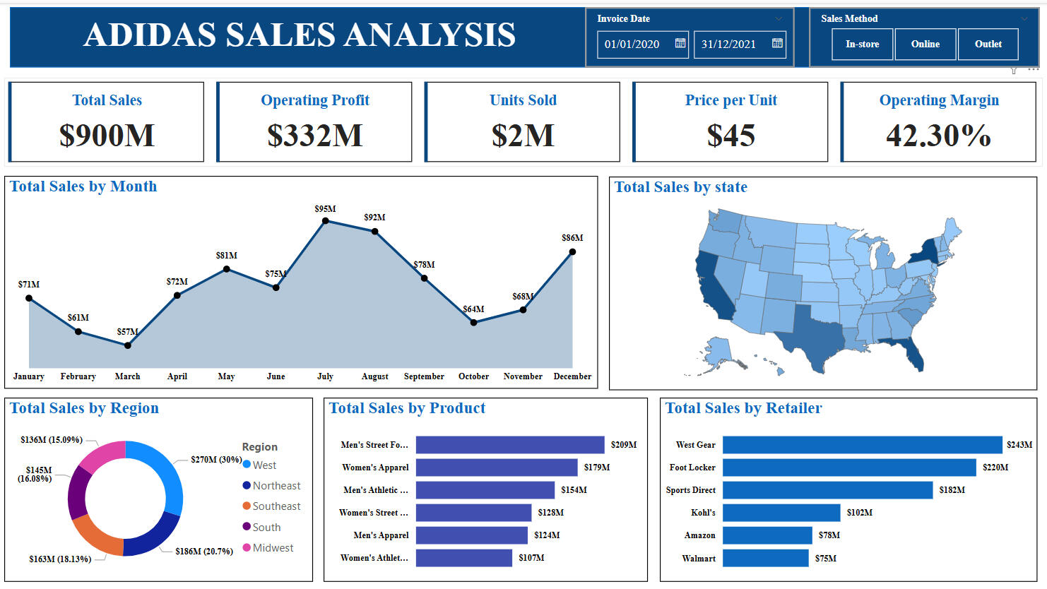
Designed an interactive Power BI dashboard to analyze Adidas sales data across regions, products, and retailers, enabling clear visibility into performance and trends.✅ Objective & Initial Business QuestionsBefore creating the dashboard, the primary goal was to gain a comprehensive understanding of Adidas’ sales performance across different dimensions. The key business questions included:1. What is the total revenue, profit, and units sold during the selected period?
2. Which months saw the highest and lowest sales?
3. How does performance vary by region, state, and sales channel?
4. Which products are the top-selling?
5. Which retailers are contributing most to the revenue?
6. What is the average price per unit and operating margin?
7. What patterns or trends can be observed for strategic decision-making?---🧩 Steps to Build the Dashboard1. Data Collection & Preparation:* Collected raw transactional data including fields such as invoice date, region, state, product type, sales amount, units sold, cost, profit, and sales method.
* Cleaned and transformed the data in Power Query Editor: handled missing values, ensured consistent formats, and created calculated columns (e.g., Price per Unit, Operating Margin).2. Data Modeling:* Established relationships between tables (e.g., Date table with Sales table, Product table).
* Created DAX measures for:* Total Sales
* Operating Profit
* Units Sold
* Price per Unit (Sales ÷ Units)
* Operating Margin (Profit ÷ Sales)3. Dashboard Design & Visualization:* Created cards for high-level KPIs.
* Designed a time series chart for monthly trends.
* Used:* Map for geographical state-wise distribution.
* Donut Chart for regional sales share.
* Bar Charts for breakdowns by product and retailer.
* Applied consistent styling for readability (color-coded regions, bold KPI values, etc.).4. Interactivity via Slicers:* Implemented Invoice Date slicer to allow filtering by time.
* Added Sales Method slicer (In-store, Online, Outlet) for channel-based performance analysis.
* These slicers make the dashboard dynamic and support self-service exploration by end users.---🔍 Key Takeaways from the Analysis* Total Revenue: $900M, with a healthy Operating Profit of $332M and a strong Operating Margin of 42.3%.
* Monthly Performance: Sales peaked in July ($95M) and dipped in March ($57M), indicating seasonal trends.
* Top Regions: The West region leads at $270M, followed by the Midwest and South.
* Best-Selling Product: Men’s Street Footwear generated the highest revenue at $209M.
* Retailer Performance: West Gear and Foot Locker are top performers, accounting for nearly 50% of retailer sales.
* Geographical Insights: High sales in California, Texas, Florida, and New York, suggesting focus areas for future campaigns.---🎯 Final ThoughtsThis dashboard provides stakeholders with a powerful, at-a-glance view of Adidas' performance. It enables data-driven decisions on product strategy, retail partnerships, and regional marketing campaigns. The combination of visuals, metrics, and slicers ensures a user-friendly and insightful analytical tool.
SQL
SQL | COVID-19 DATA CLEANING & PREPARATION
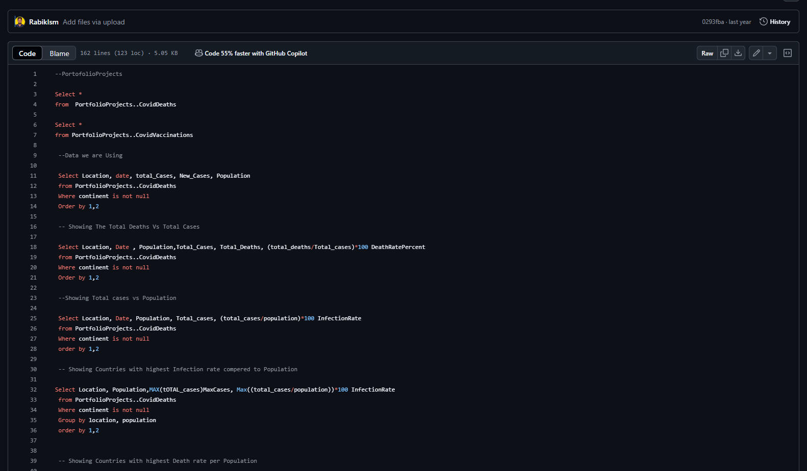
🦠 COVID-19 Data Exploration with SQL📊 Project OverviewThis project is a comprehensive SQL-based data exploration of the global COVID-19 pandemic using two datasets:* CovidDeaths
* CovidVaccinationsThe goal is to uncover trends, compare infection and death rates, evaluate vaccination rollouts, and create views for data visualization in Power BI or other BI tools.---🎯 Key Business Questions Explored1. What is the death rate vs. infection rate by country?
2. Which countries had the highest infection and death rates relative to population?
3. What does the global progression of cases and deaths look like over time?
4. How many people were vaccinated globally and what percentage of the population was covered?
5. Which continents and countries had the highest number of deaths?
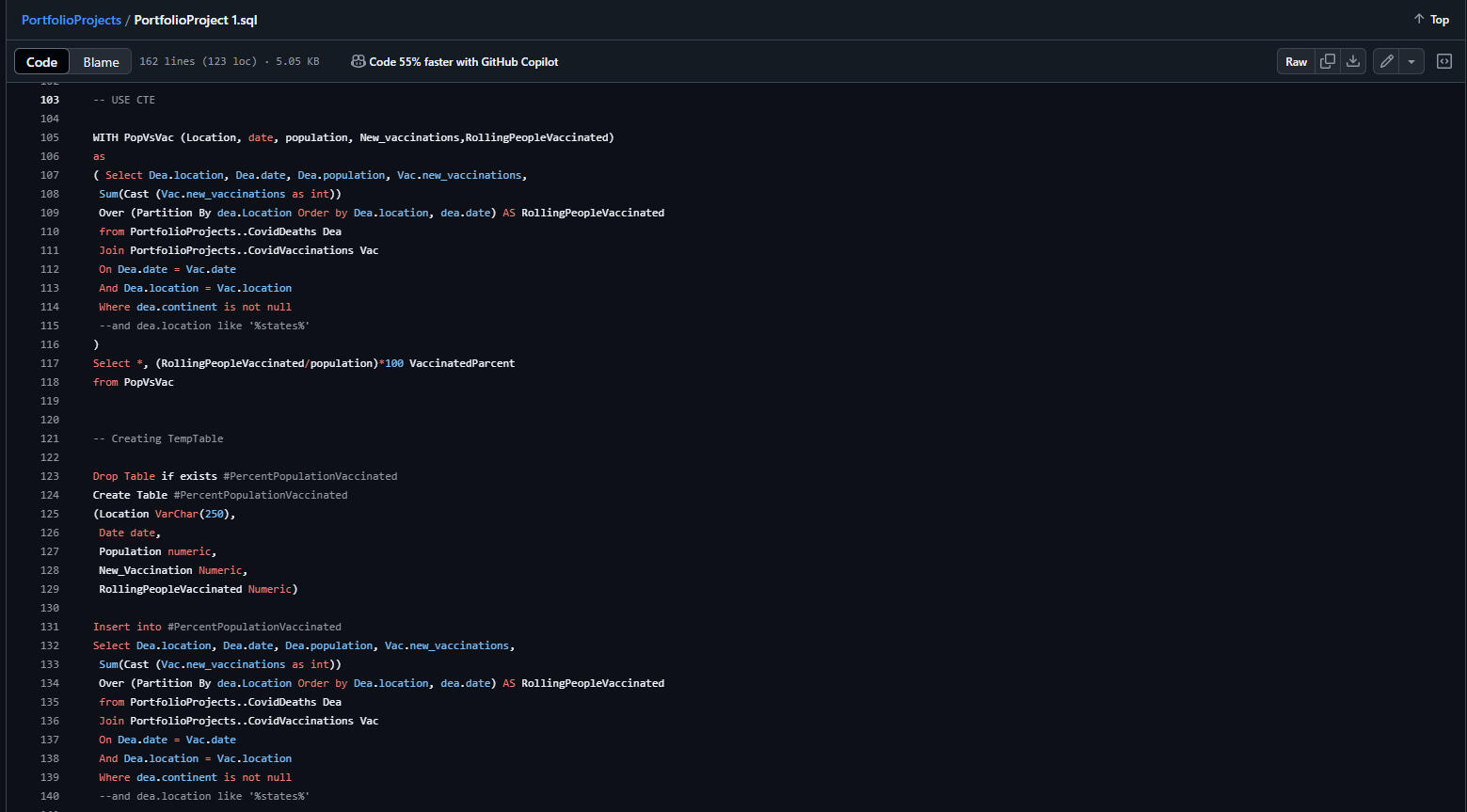
6. How can we prepare the dataset for BI tools using temporary tables and views?---
🛠️ Steps Taken1. Data Inspection* Loaded and previewed tables: CovidDeaths and CovidVaccinations.2. Cleaning & Filtering* Removed continent-level data for clarity.
* Filtered rows where continent IS NOT NULL.3. Core Analysis* Infection Rate = (total_cases / population) * 100
* Death Rate = (total_deaths / total_cases) * 100
* Identified countries with:* Highest infection rates
* Highest deaths per population4. Aggregation by Continent & World* Aggregated new cases and deaths by date to see global progression.
* Calculated global fatality rate over time.5. Vaccination Analysis* Joined CovidDeaths and CovidVaccinations on date and location.
* Created rolling totals of vaccinations using WINDOW FUNCTIONS.
* Computed vaccination percentage = (rolling people vaccinated / population) * 1006. Temporary Table & View Creation* Built a temp table #PercentPopulationVaccinated for reuse.
* Created a view PercentPopulationVaccinated to easily pull clean, processed vaccination data into Power BI dashboards.
6. Temporary Table & View Creation* Built a temp table #PercentPopulationVaccinated for reuse.
* Created a view PercentPopulationVaccinated to easily pull clean, processed vaccination data into Power BI dashboards.---📌 Tools & Techniques Used* SQL Server* Joins
* Aggregates (SUM, MAX)
* CTEs (Common Table Expressions)
* Temp Tables
* Views
* Window Functions (OVER, PARTITION BY)
* Data Modeling for BI* Prepared view specifically for visualization tools like Power BI---📈 Key Insights* Some countries had infection rates above 20% of their population.
* Death rates varied but remained below 5% in most regions.
* The United States, India, and Brazil consistently showed high numbers.
* Vaccination rollouts began gradually, with measurable progress by mid-2021.
* Rolling totals and percentage vaccinated metrics provide insight into public health campaign effectiveness.

✅ Final NotesThis project demonstrates how raw COVID-19 datasets can be transformed into actionable insights using only SQL. The final cleaned data and views are ready for integration into Power BI dashboards to support data-driven public health decisions.